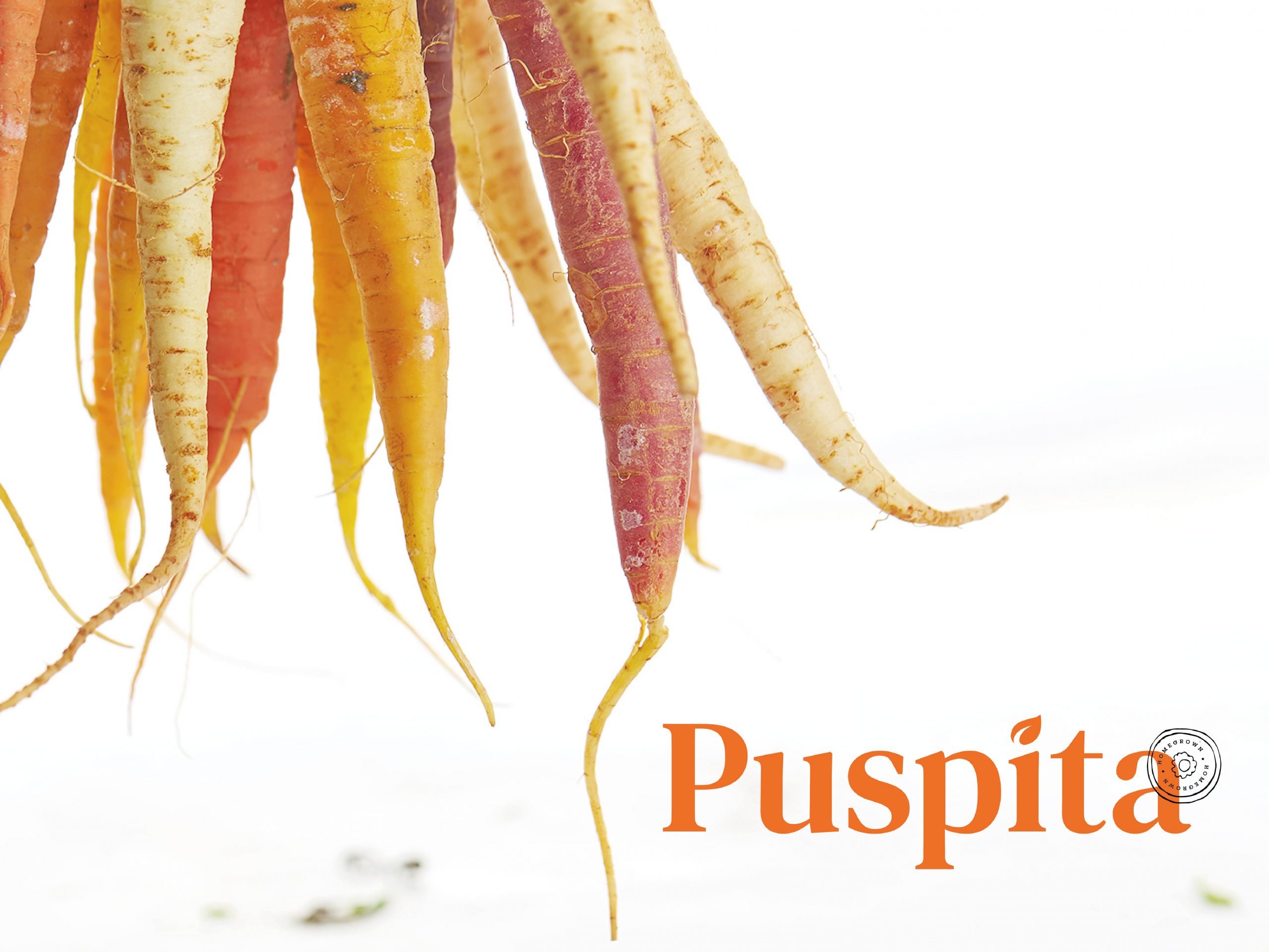
Puspita Homegrown
It means flower in Sanskrit. It's a homegrown brand, which grown or produced in one's own garden. Very local, truly humble. It’s not all about the vegetables, Puspita will develop its brand to be commerce, to invite the local community to have a market there.
The main color of orange, is the color of tropics, with the fusion of energy and joy. The color orange stimulates activity and our ability to socialize, as the main vision to blend with the local community. We use this color to stand out between the greens.
Selected Works

Wicky SyailendraWebsite
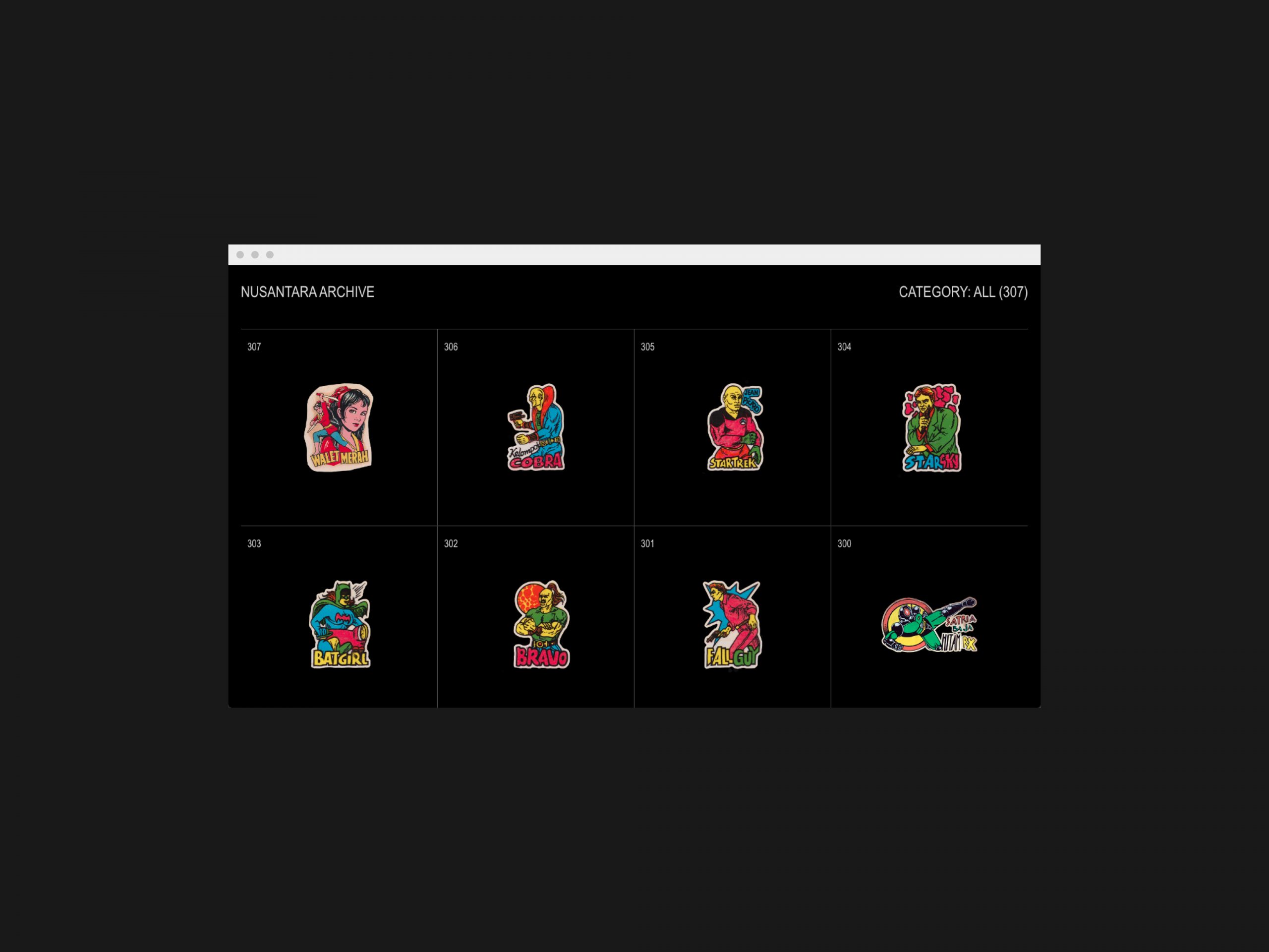
Grafis NusantaraWebsite

From Alphabet CoWebsite

Hatcher StudioUX Studio

NineTwlveMusic Records

Cipsi StudioWebsite
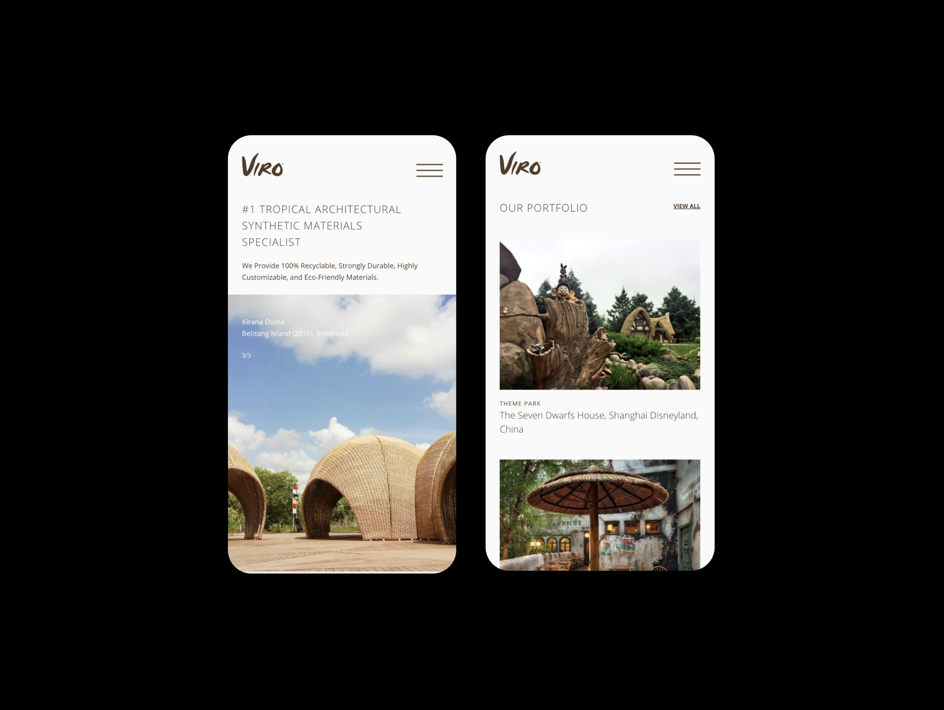
Viro WorldWebsite

MeltsChocolate Wonderland Hampers

KijiPottery
© AFTERANOTHER
© AFTERANOTHER
© AFTERANOTHER
© AFTERANOTHER
© AFTERANOTHER
WORKING WORLD WIDE
WORKING WORLD WIDE
WORKING WORLD WIDE
WORKING WORLD WIDE
WORKING WORLD WIDE

